From its days as a wartime engine supplier for Adolf Hitler’s combat aircraft to the present as a purveyor of the world’s ultimate driving machines, BMW has never found the need to change or modify its brand logo. Until now, that is. The blue-and-white center and the black outer ring with the bold BMW typeface have symbolized the engineering excellence that the German automaker is known for.
But in this day and age when cars have become elements in the digital playground, BMW has thought it best to give its revered emblem a much-needed metamorphosis in order to reflect this major shift in the motoring landscape. It now sports a minimalist theme with a revised font and a transparent border where the opaque black ring used to be. This allows the updated roundel to blend in with its background, which could be a print ad or the hood of a BMW vehicle.
The new logo also loses its three-dimensional bulge, which, according to company officials, makes it more suitable for the digital age. The simpler-looking badge is easier to pair with communication materials such as press releases. It also represents BMW’s goal of being an automotive tech giant in its own right with innovative mobility solutions, as well as maintaining its reputation as a builder of driver-focused cars.
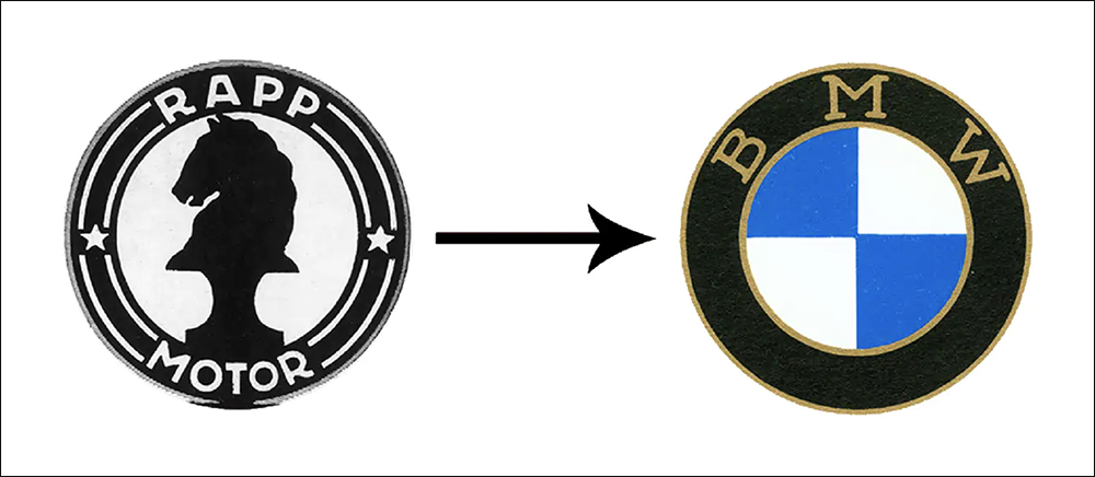
Now, most people think that the BMW logo is modeled after a rotating propeller, but it isn’t. In fact, the company had started making aero engines long before it was called Bayerische Motoren Werke. The firm traces its roots to Rapp Motorenwerke, which was established in 1913 to build and maintain the German Air Force’s fleet. The name BMW first appeared in 1917, when it was used on the now-famous roundel that adopted the ring design of Rapp’s logo with the state colors of Bavaria at its center. The aerial connection came in a 1929 ad, when the logo was artfully integrated into the picture of an airplane’s spinning propeller.


Comments